Edit chart
Loading graph
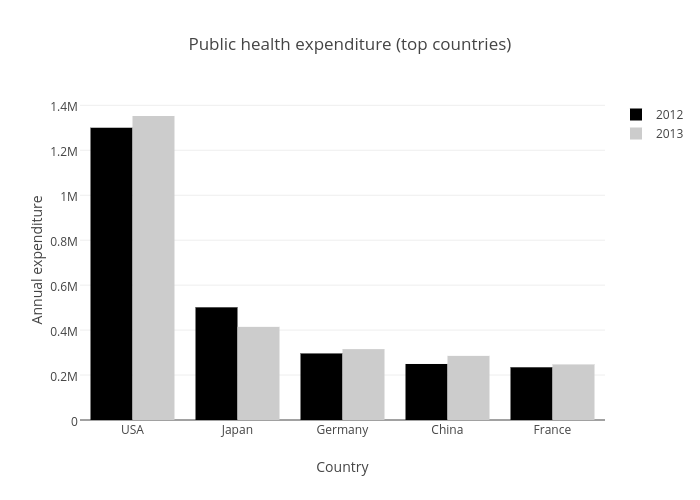
Storybench's interactive graph and data of "Public health expenditure (top countries)" is a bar chart, showing 2012 vs 2013; with Country in the x-axis and Annual expenditure in the y-axis.. The x-axis shows values from 0.5 to 5.5. The y-axis shows values from 0 to 1423740.