Edit chart
Loading graph
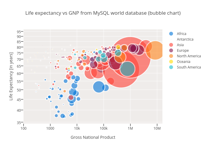
Takanori's interactive graph and data of "Life expectancy vs GNP from MySQL world database (bubble chart)" is a scatter chart, showing Africa, Antarctica, Asia, Europe, North America, Oceania, South America; with Gross National Product in the x-axis and Life Expectancy [in years] in the y-axis.. The x-axis shows values from 2.0 to 7.2. The y-axis shows values from 0 to 0.