Edit chart
Loading graph
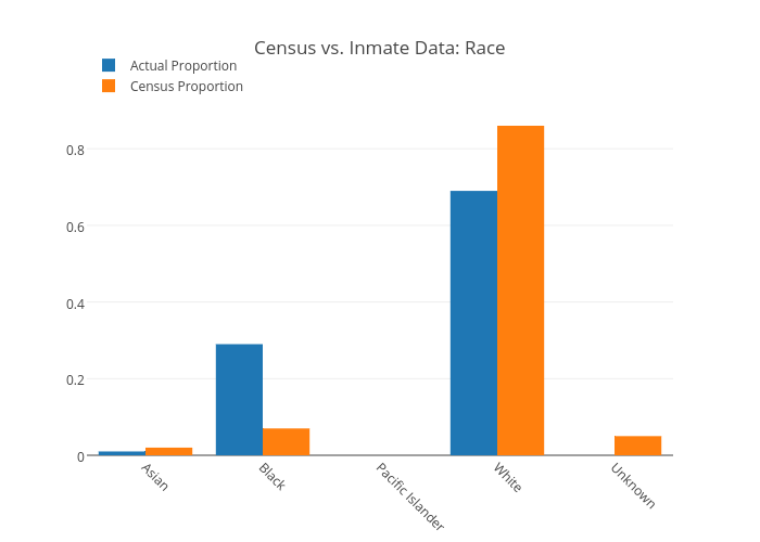
Tammylarmstrong's interactive graph and data of "Census vs. Inmate Data: Race" is a grouped bar chart, showing Actual Proportion vs Census Proportion. The x-axis shows values from 0 to 0. The y-axis shows values from 0 to 0.