Edit chart
Loading graph
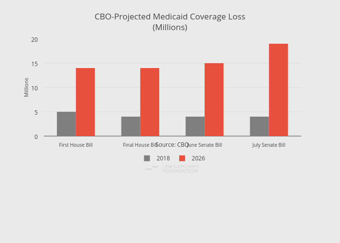
Thecenturyfoundation's interactive graph and data of "CBO-Projected Medicaid Coverage Loss(Millions)" is a bar chart, showing 2018 vs 2026; with in the x-axis and Millions in the y-axis.. The x-axis shows values from -0.5 to 3.5. The y-axis shows values from 0 to 20. This visualization has the following annotation: Source: CBO