Edit chart
Loading graph
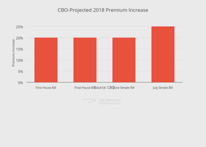
Thecenturyfoundation's interactive graph and data of "CBO-Projected 2018 Premium Increase" is a bar chart, showing Subsidy Cuts (Billions); with in the x-axis and Premium Increase in the y-axis.. The x-axis shows values from -0.5 to 3.5. The y-axis shows values from 0 to 26.315789473684212. This visualization has the following annotation: Source: CBO