Edit chart
Loading graph
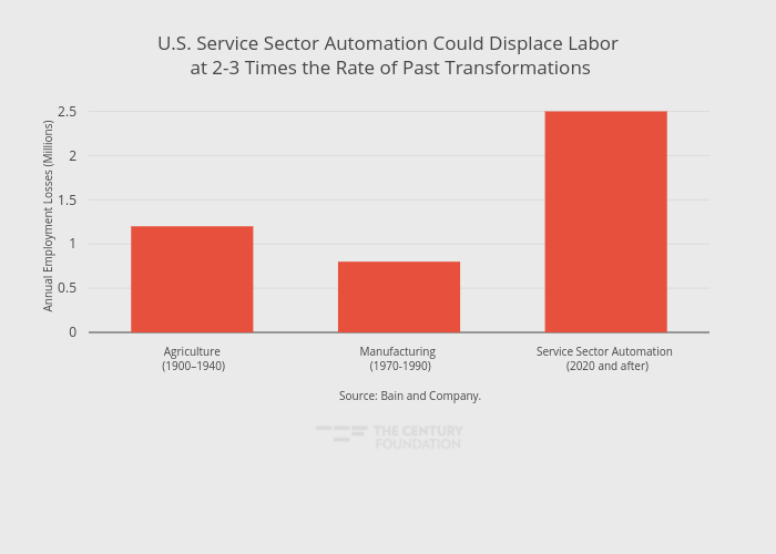
Thecenturyfoundation's interactive graph and data of "U.S. Service Sector Automation Could Displace Labor at 2-3 Times the Rate of Past Transformations" is a bar chart, showing Annual Employment Losses (Millions); with Annual Employment Losses (Millions) in the y-axis. The x-axis shows values from -0.5 to 2.5. The y-axis shows values from 0 to 2.6315789473684212. This visualization has the following annotation: Source: Bain and Company.