Edit chart
Loading graph
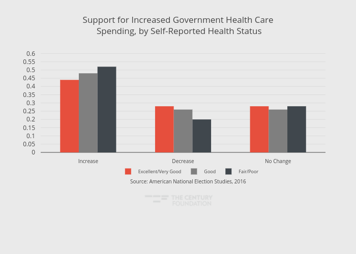
Thecenturyfoundation's interactive graph and data of "Support for Increased Government Health Care Spending, by Self-Reported Health Status" is a grouped bar chart, showing Excellent/Very Good, Good, Fair/Poor. The x-axis shows values from -0.5 to 2.5. The y-axis shows values from 0 to 0.6473684210526315. This visualization has the following annotation: Source: American National Election Studies, 2016