Edit chart
Loading graph
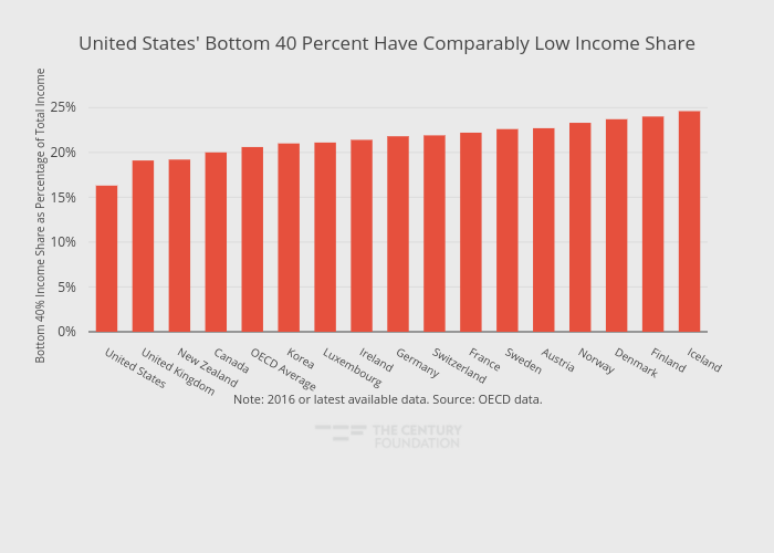
Thecenturyfoundation's interactive graph and data of "United States' Bottom 40 Percent Have Comparably Low Income Share" is a bar chart, showing Percent Change December 2016/17; with in the x-axis and Bottom 40% Income Share as Percentage of Total Income in the y-axis.. The x-axis shows values from -0.5 to 16.5. The y-axis shows values from 0 to 25.894736842105264. This visualization has the following annotation: Note: 2016 or latest available data. Source: OECD data.