Edit chart
Loading graph
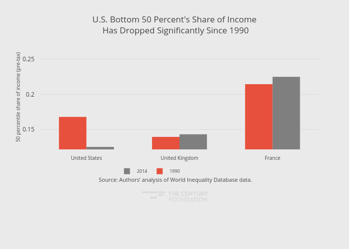
Thecenturyfoundation's interactive graph and data of "U.S. Bottom 50 Percent's Share of Income Has Dropped Significantly Since 1990" is a grouped bar chart, showing 1990 vs 2014; with in the x-axis and 50 percentile share of income (pre-tax) in the y-axis.. The x-axis shows values from -0.5 to 2.5. The y-axis shows values from 0.122 to 0.27. This visualization has the following annotation: Source: Authors’ analysis of World Inequality Database data.