Edit chart
Loading graph
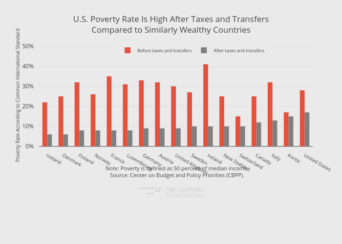
Thecenturyfoundation's interactive graph and data of "U.S. Poverty Rate Is High After Taxes and TransfersCompared to Similarly Wealthy Countries" is a grouped bar chart, showing Before taxes and transfers vs After taxes and transfers; with in the x-axis and Poverty Rate According to Common International Standard in the y-axis.. The x-axis shows values from -0.5 to 16.5. The y-axis shows values from 0 to 51.1578947368421. This visualization has the following annotation: Note: Poverty is defined as 50 percent of median income.Source: Center on Budget and Policy Priorities (CBPP).