Edit chart
Loading graph
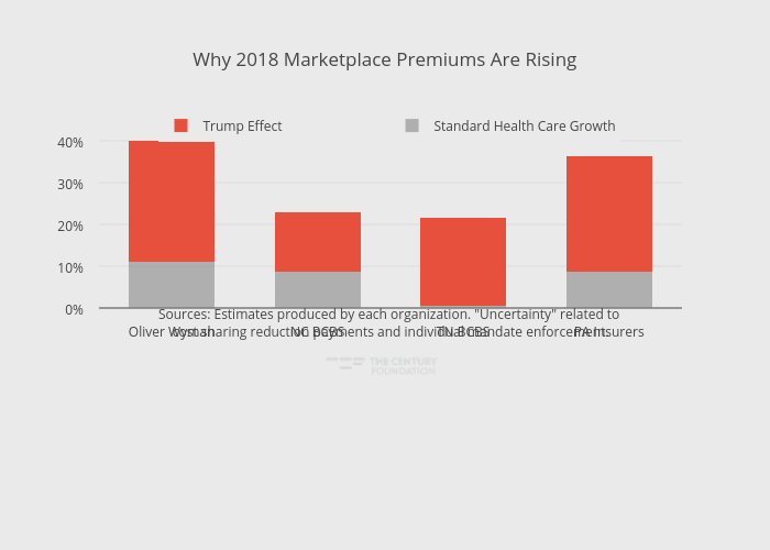
Thecenturyfoundation's interactive graph and data of "Why 2018 Marketplace Premiums Are Rising" is a stacked bar chart, showing Standard Health Care Growth vs Trump Effect; with in the x-axis. The x-axis shows values from -0.5 to 3.5. The y-axis shows values from 0 to 42.10526315789474. This visualization has the following annotation: Sources: Estimates produced by each organization. "Uncertainty" related to cost sharing reduction payments and individual mandate enforcement.