Edit chart
Loading graph
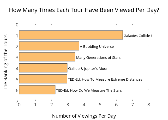
Ting.yuansen's interactive graph and data of "How Many Times Each Tour Have Been Viewed Per Day?" is a bar chart. The x-axis shows values from 0 to 0. The y-axis shows values from 0 to 0. This visualization has the following annotations: Galaxies Collide !; A Bubbling Universe; Many Generations of Stars; Galileo & Jupiter's Moon; TED-Ed: How To Measure Extreme Distances; TED-Ed: How Do We Measure The Stars