Edit chart
Loading graph
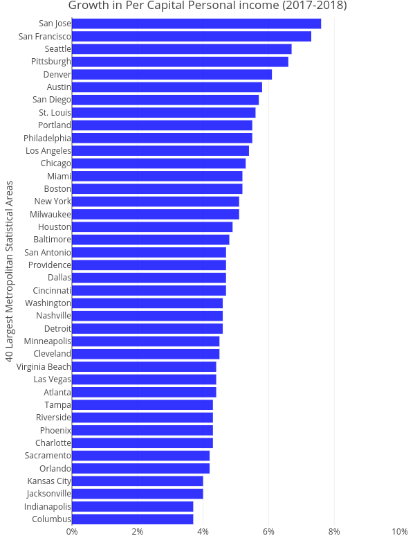
Ucsur's interactive graph and data of "Growth in Per Capital Personal income (2017-2018)" is a bar chart, showing No Name; with 40 Largest Metropolitan Statistical Areas in the y-axis. The x-axis shows values from 0 to 0.1. The y-axis shows values from 0 to 0. This visualization has the following annotation: Compiled from Bureau of Economic Analysis (BEA) data