Edit chart
Loading graph
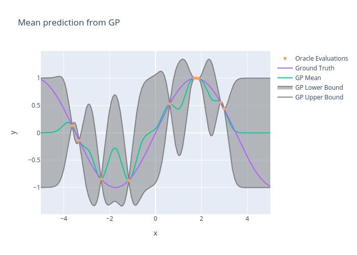
Usc_eric_vader's interactive graph and data of "Mean prediction from GP" is a line chart, showing GP Upper Bound, GP Lower Bound, GP Mean, Ground Truth, Oracle Evaluations; with x in the x-axis and y in the y-axis.. The x-axis shows values from 0 to 0. The y-axis shows values from 0 to 0.