Edit chart
Loading graph
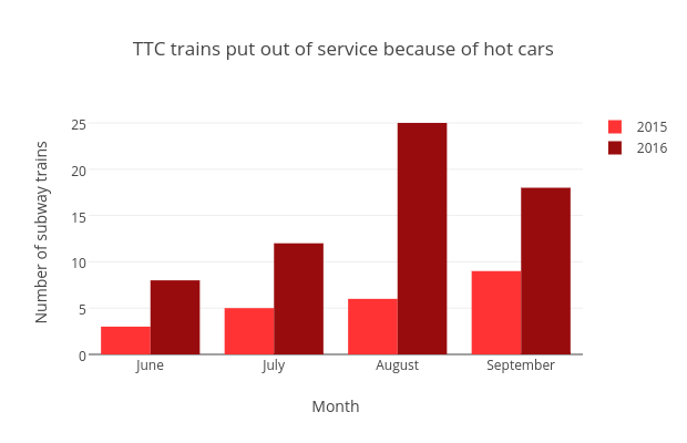
Vferreira's interactive graph and data of "TTC trains put out of service because of hot cars " is a bar chart, showing 2015 vs 2016; with Month in the x-axis and Number of subway trains in the y-axis.. The x-axis shows values from -0.5 to 3.5. The y-axis shows values from 0 to 26.315789473684212.