Edit chart
Loading graph
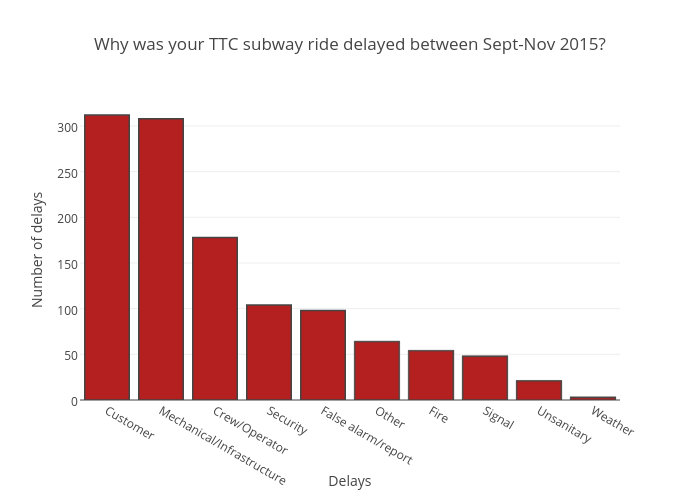
Vferreira's interactive graph and data of "Why was your TTC subway ride delayed between Sept-Nov 2015?" is a bar chart, showing B; with Delays in the x-axis and Number of delays in the y-axis.. The x-axis shows values from -0.5 to 9.5. The y-axis shows values from 0 to 328.42105263157896. This visualization has the following annotation: