Edit chart
Loading graph
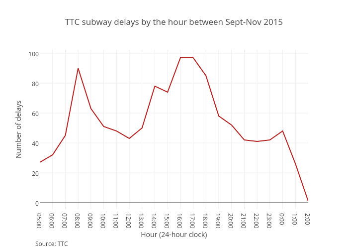
Vferreira's interactive graph and data of "TTC subway delays by the hour between Sept-Nov 2015" is a line chart, showing B; with Hour (24-hour clock) in the x-axis and Number of delays in the y-axis.. The x-axis shows values from 0 to 21. The y-axis shows values from -4.333333333333334 to 102.33333333333333. This visualization has the following annotation: Source: TTC