Parallel Categories Diagram in Python
How to make parallel categories diagrams in Python with Plotly.
New to Plotly?
Plotly is a free and open-source graphing library for Python. We recommend you read our Getting Started guide for the latest installation or upgrade instructions, then move on to our Plotly Fundamentals tutorials or dive straight in to some Basic Charts tutorials.
Parallel Categories Diagram
The parallel categories diagram (also known as parallel sets or alluvial diagram) is a visualization of multi-dimensional categorical data sets. Each variable in the data set is represented by a column of rectangles, where each rectangle corresponds to a discrete value taken on by that variable. The relative heights of the rectangles reflect the relative frequency of occurrence of the corresponding value.
Combinations of category rectangles across dimensions are connected by ribbons, where the height of the ribbon corresponds to the relative frequency of occurrence of the combination of categories in the data set.
For other representations of multivariate data, also see parallel coordinates, radar charts and scatterplot matrix (SPLOM). A visually-similar but more generic type of visualization is the sankey diagrams.
Basic Parallel Category Diagram with plotly.express
This example visualizes the restaurant bills of a sample of 244 people. Hovering over a category rectangle (sex, smoker, etc) displays a tooltip with the number of people with that single trait. Hovering over a ribbon in the diagram displays a tooltip with the number of people with a particular combination of the five traits connected by the ribbon.
By default, px.parallel_categories will display any column in the data_frame that has a cardinality (or number of unique values) of less than 50. This can be overridden either by passing in a specific list of columns to dimensions or by setting dimensions_max_cardinality to something other than 50.
import plotly.express as px
df = px.data.tips()
fig = px.parallel_categories(df)
fig.show()
Style Diagram
In this example dimensions represents a list of stings or the columns of data frame, and labels is a dictionary with string keys (column name) and string values ('desired label to be displayed'). See Plotly express reference page for more information.
import plotly.express as px
df = px.data.tips()
fig = px.parallel_categories(df, dimensions=['sex', 'smoker', 'day'],
color="size", color_continuous_scale=px.colors.sequential.Inferno,
labels={'sex':'Payer sex', 'smoker':'Smokers at the table', 'day':'Day of week'})
fig.show()
Basic Parallel Categories Diagram with graph_objects
This example illustrates the hair color, eye color, and sex of a sample of 8 people. The dimension labels can be dragged horizontally to reorder the dimensions and the category rectangles can be dragged vertically to reorder the categories within a dimension.
import plotly.graph_objects as go
fig = go.Figure(go.Parcats(
dimensions=[
{'label': 'Hair',
'values': ['Black', 'Black', 'Black', 'Brown', 'Brown', 'Brown', 'Red', 'Brown']},
{'label': 'Eye',
'values': ['Brown', 'Brown', 'Brown', 'Brown', 'Brown', 'Blue', 'Blue', 'Blue']},
{'label': 'Sex',
'values': ['Female', 'Female', 'Female', 'Male', 'Female', 'Male', 'Male', 'Male']}]
))
fig.show()
Basic Parallel Categories Diagram with Counts
If the frequency of occurrence for each combination of attributes is known in advance, this can be specified using the counts property
import plotly.graph_objects as go
fig = go.Figure(go.Parcats(
dimensions=[
{'label': 'Hair',
'values': ['Black', 'Brown', 'Brown', 'Brown', 'Red']},
{'label': 'Eye',
'values': ['Brown', 'Brown', 'Brown', 'Blue', 'Blue']},
{'label': 'Sex',
'values': ['Female', 'Male', 'Female', 'Male', 'Male']}],
counts=[6, 10, 40, 23, 7]
))
fig.show()
Multi-Color Parallel Categories Diagram
The color of the ribbons can be specified with the line.color property. Similar to other trace types, this property may be set to an array of numbers, which are then mapped to colors according to the the colorscale specified in the line.colorscale property.
Here is an example of visualizing the survival rate of passengers in the titanic dataset, where the ribbons are colored based on survival outcome.
By setting the hoveron property to 'color' and the hoverinfo property to 'count+probability' the tooltips now display count and probability information for each color (survival outcome) per category.
By setting the arrangement property to 'freeform' it is now possible to drag categories horizontally to reorder dimensions as well as vertically to reorder categories within the dimension.
import plotly.graph_objects as go
import pandas as pd
titanic_df = pd.read_csv("https://raw.githubusercontent.com/plotly/datasets/master/titanic.csv")
# Create dimensions
class_dim = go.parcats.Dimension(
values=titanic_df.Pclass,
categoryorder='category ascending', label="Class"
)
gender_dim = go.parcats.Dimension(values=titanic_df.Sex, label="Gender")
survival_dim = go.parcats.Dimension(
values=titanic_df.Survived, label="Outcome", categoryarray=[0, 1],
ticktext=['perished', 'survived']
)
# Create parcats trace
color = titanic_df.Survived;
colorscale = [[0, 'lightsteelblue'], [1, 'mediumseagreen']];
fig = go.Figure(data = [go.Parcats(dimensions=[class_dim, gender_dim, survival_dim],
line={'color': color, 'colorscale': colorscale},
hoveron='color', hoverinfo='count+probability',
labelfont={'size': 18, 'family': 'Times'},
tickfont={'size': 16, 'family': 'Times'},
arrangement='freeform')])
fig.show()
Parallel Categories Linked Brushing
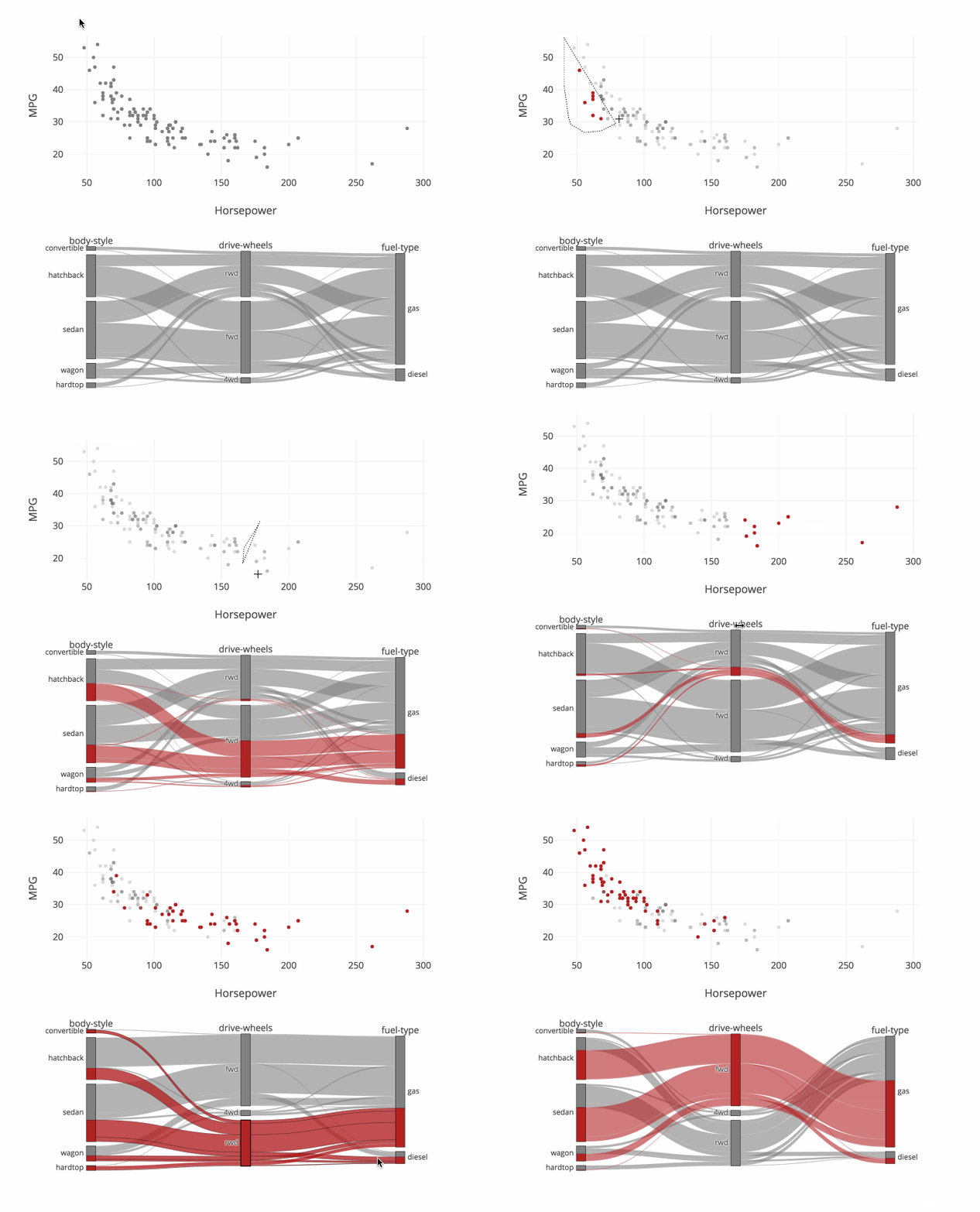
This example demonstrates how the on_selection and on_click callbacks can be used to implement linked brushing between 3 categorical dimensions displayed with a parcats trace and 2 continuous dimensions displayed with a scatter trace.
This example also sets the line.shape property to hspline to cause the ribbons to curve between categories.
Note: In order for the callback functions to be executed the figure must be a FigureWidget, and the figure should display itself.
import plotly.graph_objects as go
from ipywidgets import widgets
import pandas as pd
import numpy as np
cars_df = pd.read_csv('https://raw.githubusercontent.com/plotly/datasets/master/imports-85.csv')
# Build parcats dimensions
categorical_dimensions = ['body-style', 'drive-wheels', 'fuel-type'];
dimensions = [dict(values=cars_df[label], label=label) for label in categorical_dimensions]
# Build colorscale
color = np.zeros(len(cars_df), dtype='uint8')
colorscale = [[0, 'gray'], [1, 'firebrick']]
# Build figure as FigureWidget
fig = go.FigureWidget(
data=[go.Scatter(x=cars_df.horsepower, y=cars_df['highway-mpg'],
marker={'color': 'gray'}, mode='markers', selected={'marker': {'color': 'firebrick'}},
unselected={'marker': {'opacity': 0.3}}), go.Parcats(
domain={'y': [0, 0.4]}, dimensions=dimensions,
line={'colorscale': colorscale, 'cmin': 0,
'cmax': 1, 'color': color, 'shape': 'hspline'})
])
fig.update_layout(
height=800, xaxis={'title': 'Horsepower'},
yaxis={'title': 'MPG', 'domain': [0.6, 1]},
dragmode='lasso', hovermode='closest')
# Update color callback
def update_color(trace, points, state):
# Update scatter selection
fig.data[0].selectedpoints = points.point_inds
# Update parcats colors
new_color = np.zeros(len(cars_df), dtype='uint8')
new_color[points.point_inds] = 1
fig.data[1].line.color = new_color
# Register callback on scatter selection...
fig.data[0].on_selection(update_color)
# and parcats click
fig.data[1].on_click(update_color)
fig

Parallel Categories with Multi-Color Linked Brushing
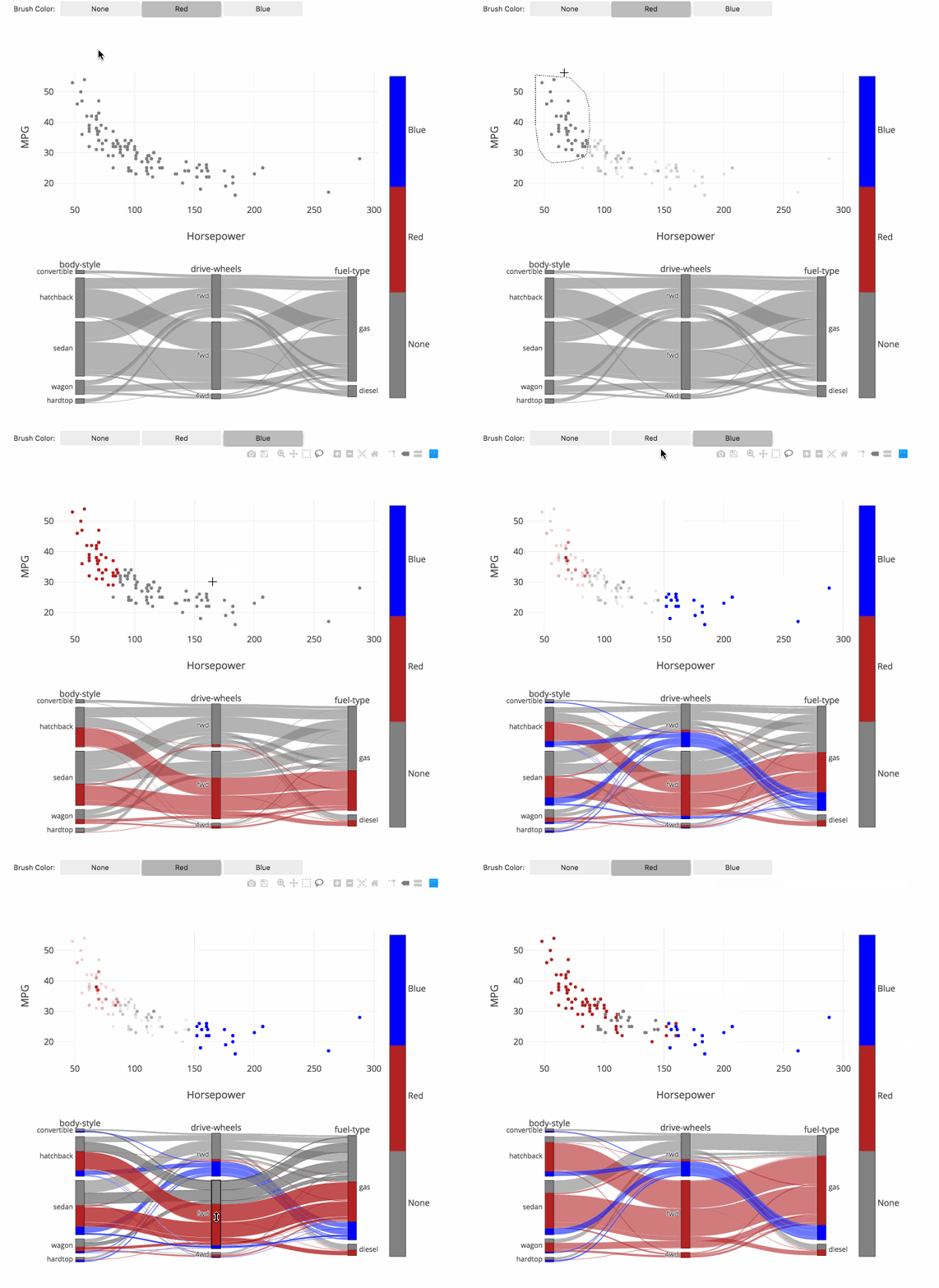
This example extends the previous example to support brushing with multiple colors. The toggle buttons above may be used to select the active color, and this color will be applied when points are selected in the scatter trace and when categories or ribbons are clicked in the parcats trace.
import plotly.graph_objects as go
import ipywidgets as widgets
import pandas as pd
import numpy as np
cars_df = pd.read_csv('https://raw.githubusercontent.com/plotly/datasets/master/imports-85.csv')
# Build parcats dimensions
categorical_dimensions = ['body-style', 'drive-wheels', 'fuel-type']
dimensions = [dict(values=cars_df[label], label=label) for label in categorical_dimensions]
# Build colorscale
color = np.zeros(len(cars_df), dtype='uint8')
colorscale = [[0, 'gray'], [0.33, 'gray'],
[0.33, 'firebrick'], [0.66, 'firebrick'],
[0.66, 'blue'], [1.0, 'blue']]
cmin = -0.5
cmax = 2.5
# Build figure as FigureWidget
fig = go.FigureWidget(
data=[go.Scatter(x=cars_df.horsepower, y=cars_df['highway-mpg'],
marker={'color': color, 'cmin': cmin, 'cmax': cmax,
'colorscale': colorscale, 'showscale': True,
'colorbar': {'tickvals': [0, 1, 2], 'ticktext': ['None', 'Red', 'Blue']}},
mode='markers'),
go.Parcats(domain={'y': [0, 0.4]}, dimensions=dimensions,
line={'colorscale': colorscale, 'cmin': cmin,
'cmax': cmax, 'color': color, 'shape': 'hspline'})]
)
fig.update_layout(height=800, xaxis={'title': 'Horsepower'},
yaxis={'title': 'MPG', 'domain': [0.6, 1]},
dragmode='lasso', hovermode='closest')
# Build color selection widget
color_toggle = widgets.ToggleButtons(
options=['None', 'Red', 'Blue'],
index=1, description='Brush Color:', disabled=False)
# Update color callback
def update_color(trace, points, state):
# Compute new color array
new_color = np.array(fig.data[0].marker.color)
new_color[points.point_inds] = color_toggle.index
with fig.batch_update():
# Update scatter color
fig.data[0].marker.color = new_color
# Update parcats colors
fig.data[1].line.color = new_color
# Register callback on scatter selection...
fig.data[0].on_selection(update_color)
# and parcats click
fig.data[1].on_click(update_color)
# Display figure
widgets.VBox([color_toggle, fig])

Reference
See function reference for px.parallel_categories() or reference page for more information and chart attribute options!
What About Dash?
Dash is an open-source framework for building analytical applications, with no Javascript required, and it is tightly integrated with the Plotly graphing library.
Learn about how to install Dash at https://dash.plot.ly/installation.
Everywhere in this page that you see fig.show(), you can display the same figure in a Dash application by passing it to the figure argument of the Graph component from the built-in dash_core_components package like this:
import plotly.graph_objects as go # or plotly.express as px
fig = go.Figure() # or any Plotly Express function e.g. px.bar(...)
# fig.add_trace( ... )
# fig.update_layout( ... )
from dash import Dash, dcc, html
app = Dash()
app.layout = html.Div([
dcc.Graph(figure=fig)
])
app.run_server(debug=True, use_reloader=False) # Turn off reloader if inside Jupyter


